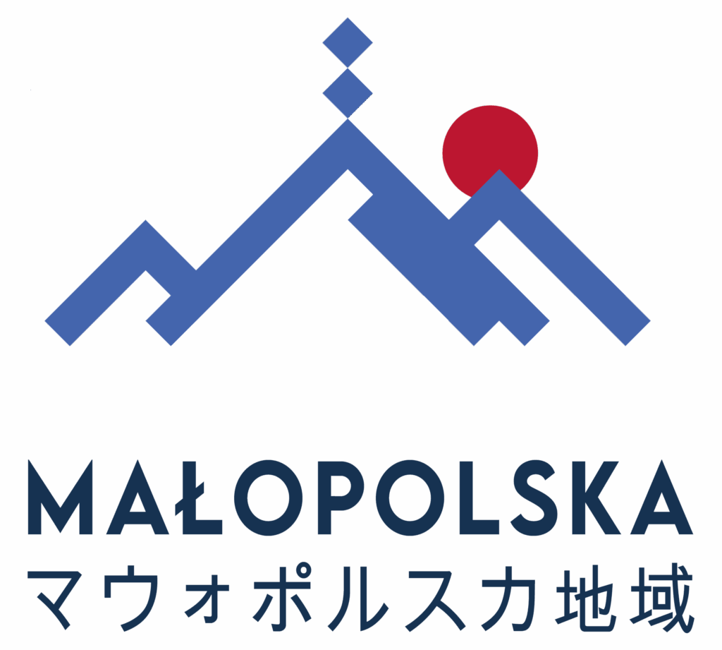
The graphic concept is key to Małopolska’s identity. The mountain line ending with the cross on Giewont refers to the majesty of the Tatra Mountains, which for centuries have shaped the character and sensitivity of the region’s inhabitants. It tells the story of a place where nature meets rich urban tradition: where high peaks inspire reaching further, and the flavor and legend of the city invite you to “feel more.”
The symbol is designed in a minimalist, geometric form. The two outer ridges form a clear outline of the letter “M,” referencing the key motif of Małopolska’s identity. The central peak is topped with a group of three small squares – a simplified image of the cross on Giewont, the region’s most iconic mountain symbol. The dynamic composition is completed by a red circle on the right side, evoking the colors of Japan and the universal symbol of the rising sun, while also pointing toward the direction of shared international cooperation.


